The Psychology of Color and Typography in Premium Branding for Tech Startups
Abdullah Mubin
Founder
When launching a tech startup, the biggest battle isn't building the product—it’s getting users to trust you. When a founder or investor lands on your website, they make a split-second decision about your credibility. If your design feels generic, cluttered, or outdated, they assume your product is the same. That is why premium branding matters.
At Wizora Studio, we design digital identities for tech companies. If you look at our layouts, you'll see sleek dark aesthetics, subtle gradients, and clean type pairing. These choices are driven by design psychology. Let’s break down how we use color theory and typography to establish immediate brand authority.
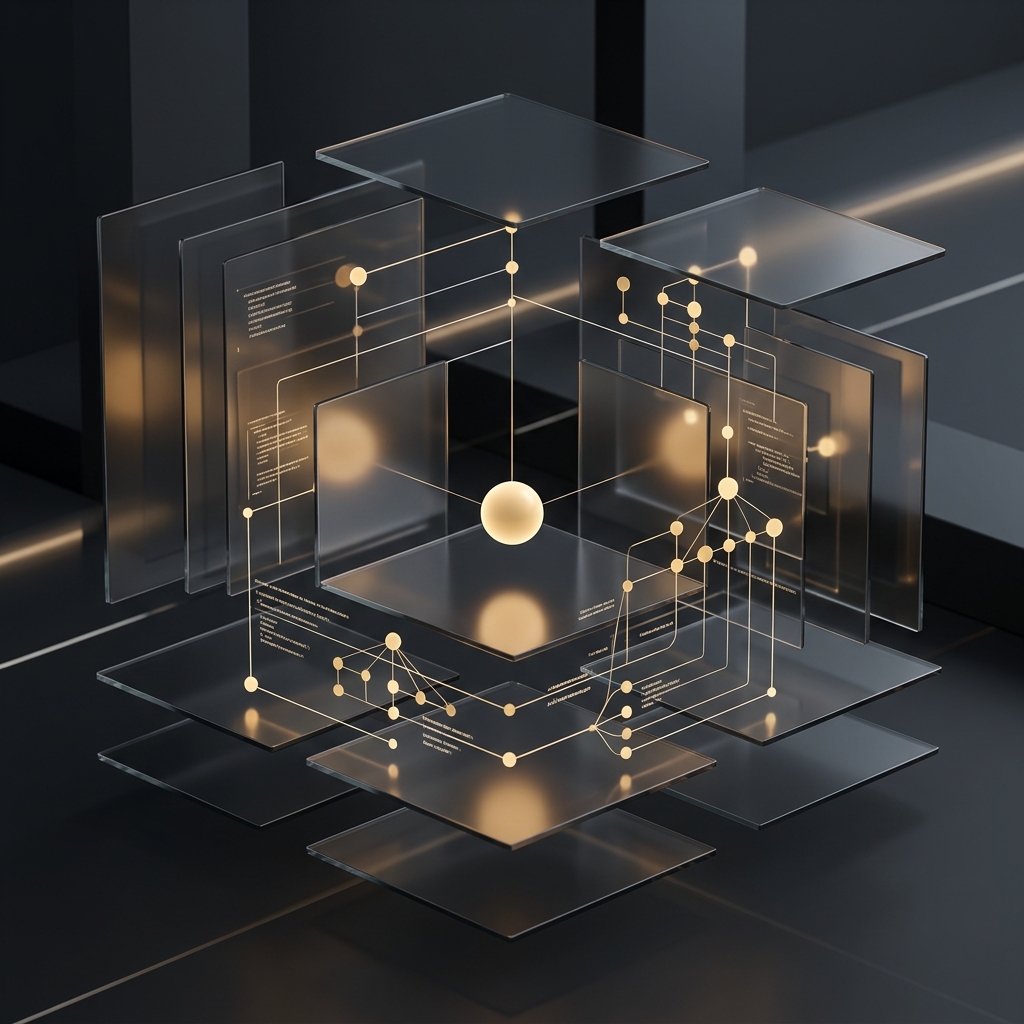
The Dark Mode Aesthetic: Prestige and Focus
There’s a reason developer tools and luxury brands default to dark interfaces. It isn’t just a visual trend; it influences how users engage with content.
A dark background instantly projects a premium, modern feel. In physical retail, luxury brands use black to represent sophistication and quality. In web design, a dark canvas does three things:
- Reduces Eye Strain: Founders and tech professionals spend hours in front of screens. A dark layout is easier to read over long sessions.
- Accents What Matters: In a dark workspace, bright colors stand out immediately. We use accent colors to draw the eye to key CTAs.
- Conveys Quality: A clean, spacious dark layout feels less like a loud advertisement and more like an art gallery, letting your work speak for itself.
The Color Psychology of Accent Elements
On a dark layout, you must use color sparingly. Too many colors create visual clutter. Instead, select key accents that communicate your brand values.
Cyan and Electric Blue: Precision and Speed
Cyan and electric blue are associated with modern technology, speed, and precision. Psychologically, blue builds trust and reliability. In a tech context, a vibrant cyan accent implies high-speed performance and innovation. It tells your visitors that your platform is modern and works flawlessly.
Amber, Gold, and Warm Accents: Artistry and Custom Quality
Warm accents like amber or soft gold represent premium quality, bespoke detail, and quality craftsmanship. While blue is technical, amber feels artistic. When combined with a dark theme, it signals that your agency values custom work and attention to detail. It balances the cold feel of technology with human design.
"Color is a silent communicator. In premium branding, we don't choose colors based on personal preference. We choose them based on the emotional contract we want to build with the user."
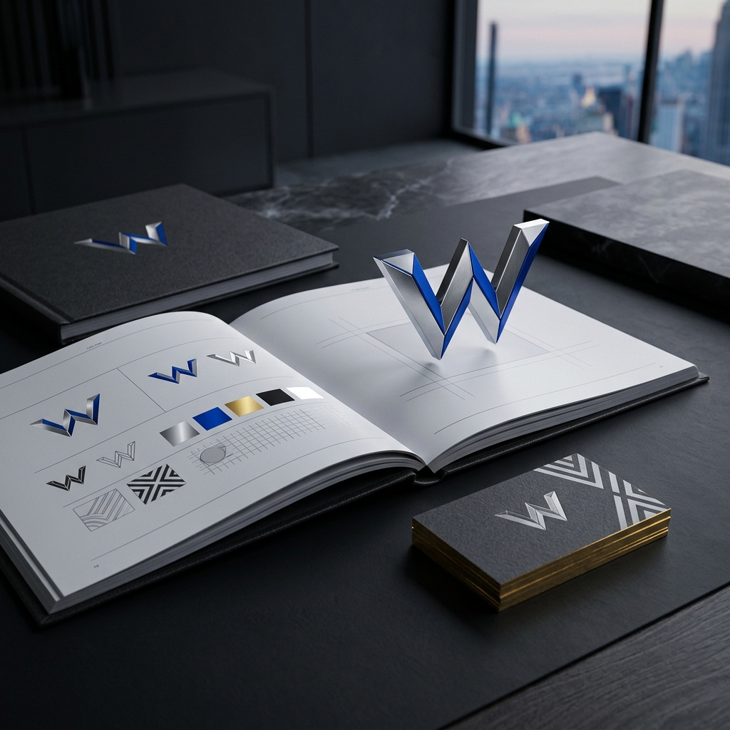
Typography: The Voice You Can See
If colors set the tone, typography defines the voice. The fonts you select tell visitors how to read your brand before they even process the words on the page.
Sans-Serif vs. Serif in Tech Branding
Tech companies often favor clean, geometric sans-serif typefaces (like Inter or Roboto) because they represent clarity and accessibility. But to stand out, premium tech brands are pairing these with geometric display fonts (like Outfit or Lexend) or modern serifs for their main headings.
This pairing creates a strong visual hierarchy. The display headings demand attention and project authority, while the clean sans-serif body copy ensures that detailed info is easy to read.
Hierarchy, Spacing, and Scale
Mastering type layout requires attention to the details:
- Scale: Make sure your headings are significantly larger than body copy. Visual hierarchy guides the reader's eye naturally.
- Tracking (Letter-Spacing): In display headings, tight tracking (like
tracking-tighter) feels punchy and cohesive. For small metadata tags, wide tracking (liketracking-widest) creates a clean, premium look. - Leading (Line-Height): Body text needs generous line-height to stay readable, while large display headings need tight line-height to keep the words visually connected.
Building Trust Through Details
Every element of your branding—from font choice to spacing—either builds or breaks trust with your audience. By combining dark mode aesthetics, clean typography, and a tailored accent palette, you can present a premium brand identity that resonates with high-value clients.
If you're ready to define your brand identity and stand out, our design team at Wizora Studio is here to help you build a clean, custom design system.