The Evolution of Glassmorphic UI: Frosted Glass Elements in B2B SaaS Layouts

Abdullah Mubin
Founder
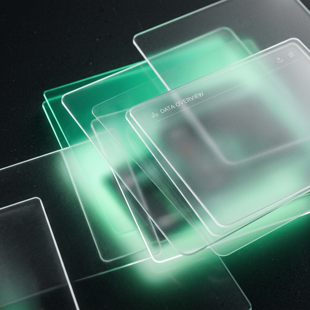
In 2020, "glassmorphism" took the design world by storm. It was characterized by ultra-bright colorful gradients blurred behind semi-transparent panels. It looked futuristic and beautiful in Figma mockups, but when developers tried to implement it in production, it often failed. It suffered from bad contrast, poor accessibility, and slowed down browser threads.
But glassmorphism didn't die; it evolved. Today, premium B2B SaaS and agency websites use a refined, mature version of glassmorphic UI. It is no longer just decorative eye candy. When used correctly, frosted glass panels solve complex dashboard layouts, define visual hierarchy, and make applications feel premium. Let's look at the engineering guidelines behind modern glassmorphic design.
1. Visual Organization without Borders
In complex dashboards, developers traditionally separate sections using solid borders or different background shades. This can make the interface look cluttered and boxy. Glassmorphism solves this by using depth instead of lines.
A frosted glass panel overlays the background, creating a distinct visual surface. Because the background content remains slightly visible through the blur, the user retains their spatial awareness within the application, making nested systems feel lighter and more integrated.
2. The Formula for Premium Glass CSS
To make glass elements look realistic and high-end, you must balance three properties: background opacity, backdrop blur, and border color. Here is our default Tailwind setup for a premium dark-mode card:
className="bg-neutral-950/70 backdrop-blur-md border border-white/[0.08] shadow-[0_8px_32px_0_rgba(0,0,0,0.37)]"Key details to note:
- Avoid Pure White Borders: Use a very fine border with low opacity (`rgba(255, 255, 255, 0.08)`) to represent the light reflection on a glass edge.
- Combine with Noise: Add a subtle, low-opacity grain texture overlay on the card background to simulate physical glass imperfections.
- Dampen the Background: Keep the background card tint dark enough (`bg-neutral-950/70`) to preserve text legibility.
"Modern glassmorphism isn't about neon colors; it is about simulating physical materials. A fine, low-opacity border and soft backdrop-blur make a dashboard layout feel tactile and organized."
3. The Accessibility Barrier
Accessibility is the main issue with glass layouts. If a user has low contrast sensitivity or uses a screen reader, blurred text can become completely illegible. To make your layouts compliant:
- Never place small body text directly over a light, high-contrast blurred gradient.
- Always set a solid background fallback color for browsers that do not support the `backdrop-filter` property.
- Ensure text-to-background contrast ratios strictly meet WCAG 2.1 AA standards (minimum 4.5:1 ratio).
Conclusion
Glassmorphic UI is a powerful tool when treated as an organization system rather than just a visual filter. By creating layered panels that reflect light and retain contrast, you build an app interface that feels modern, premium, and easy to navigate. If you want our design team to optimize your SaaS dashboard interface, let's talk at Wizora Studio.