Beyond the Grid: Breaking Design Conventions in Modern Interfaces

Abdullah Mubin
Founder
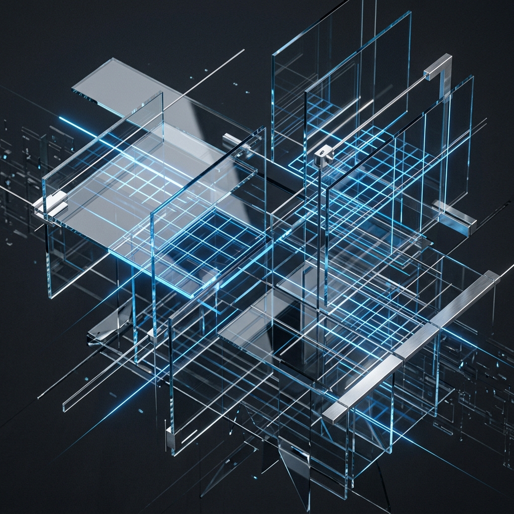
Grid systems have kept the web organized for decades. In the early days, we had tables; then came Bootstrap's 12-column system, followed by CSS Grid and Flexbox. Grids are comfortable. They create alignment, organize data, and make responsive design predictable. But if every website adheres strictly to the same grid layout, everything begins to look exactly the same—a series of clean, boxed modules that fail to excite the eye.
To build a premium, memorable digital identity, you have to look beyond standard grids. Breaking design conventions isn't about creating chaos; it is about introducing asymmetric tension, layered depth, and controlled whitespace to guide the user's attention. Let's look at how we design offset layouts that feel premium and functional.
1. The Art of Intentional Asymmetry
Asymmetry is not a mistake; it is an active design choice. When a page layout is perfectly symmetrical, it is passive. The user scans it quickly because they already know where everything will be. Asymmetry, on the other hand, creates a focal point. By placing elements off-center, you force the eye to pause and digest the information.
For example, instead of a standard split 50/50 hero section with text on the left and a centered image on the right, you can offset them:
- Allow the image to overlap the center grid line slightly.
- Push your paragraph text down, leaving a massive empty gap above it.
- Let a floating background graphic sit at a completely different vertical alignment.
This off-kilter spacing creates a modern, editorial feeling resembling a high-end physical print magazine. The key is balance: if you offset an element on the left, you must balance it with appropriate whitespace or a smaller anchor element on the right to keep the layout from feeling broken.
2. Layering and Depth: The Z-Axis
Standard web design is flat, consisting of blocks stacked on top of blocks. Premium design projects a sense of physical space. We do this by layering elements along the Z-axis:
- Frosted Glass Layers: Using semi-transparent cards that blur the content behind them to create clear, nested sections.
- Overlapping Panels: Allowing a visual mockup to overlap a card border or run past the screen edge, conveying scale.
- Shadow Play: Using soft, diffuse, multiple-stop shadows rather than single harsh drop-shadows to represent different elevations.
By overlapping text, graphics, and interactive modules, you build visual interest. The user feels as though they are interacting with physical sheets of glass and steel rather than flat code blocks.
"Symmetry is natural, but asymmetry is artistic. By introducing offset alignments and layered panels, you give your layout a unique voice that demands attention."
3. Embracing Whitespace as a Element
Developers often view empty screen space as wasted real estate, immediately trying to fill it with icons, buttons, or features. But whitespace is a critical design tool. It acts as "breathing room" for your content.
When you surround a single headline or a call-to-action button with a generous amount of whitespace, you elevate its value. It signals to the visitor that this specific piece of information is highly important. Think of an art gallery: they don't crowd 50 paintings on a single wall. They place one painting on a massive white wall, forcing you to focus entirely on it. That is the power of whitespace in UI.
Conclusion
Breaking layouts is a delicate craft. If done carelessly, the site becomes unreadable and accessibility suffers. But when done with intention—using asymmetric columns, layered Z-axis cards, and generous margins—you craft an interface that stands out in a sea of generic templates. If you want us to review your brand layouts and build a bespoke, modern design system, let's talk at Wizora Studio.