The Art of Minimalist UI: How We Design High-End Dark Interfaces for SaaS Founders
Abdullah Mubin
Founder
Walk through any high-end modern art museum, and you will notice one thing: space. The exhibits aren't crowded together; they have breathing room. The walls are clean, and the lighting is focused. This spatial layout makes the art feel valuable. The same principle applies to modern digital product design.
At Wizora Studio, we design high-converting dark-theme SaaS interfaces for startups and founders. We believe that minimalist design isn't just about deleting elements; it’s about highlighting what is important. In this guide, I will share the exact design principles we use to create premium, clean dark interfaces.
1. The Dark Base: Ditch Pure Black
The most common mistake designers make in dark mode is using pure black (#000000) for the background and pure white (#FFFFFF) for the text. This creates high visual contrast that causes eye strain and makes elements look flat.
Instead, use deep, saturated charcoal tones. For example:
- Base Background:
#050505or#0D0E12(slate dark base). - Card Backgrounds:
#121318or#1A1C23(soft grey-blue surfaces). - Borders:
rgba(255, 255, 255, 0.08)(fine glass borders that reflect light).
Using these tones creates depth. It allows you to use shadows and overlays to stack cards on top of each other, making the interface feel three-dimensional.
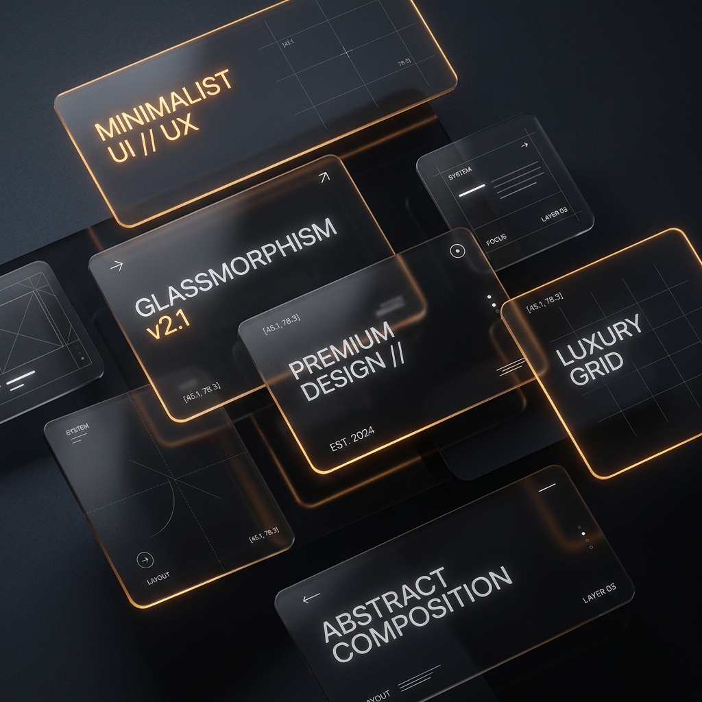
2. Glassmorphism: Creating Layered Depth
To make a dark interface feel premium, you must create a sense of physical materials. We do this using glassmorphism. By styling containers to look like sheets of frosted glass, you build a clean, layered layout.
"Glassmorphism creates depth and visual interest in dark themes. By blending background blur with fine white borders, you guide the user's attention naturally to key information panels."
A premium glassmorphic card requires three specific styling rules:
- Backdrop Filter: Apply a strong blur (e.g.,
backdrop-blur(12px)) so elements underneath blend smoothly. - Frosted Tint: Use a very faint white background opacity (e.g.,
bg-white/[0.02]) to create the frosted sheet effect. - Light-Reflective Border: Add a thin border with low opacity (e.g.,
border-white/[0.08]) to simulate light reflecting off the glass edge.
3. The Golden Accent Rule: 60-30-10
When designing a dark interface, you must use color with discipline. A common mistake is using too many bright accent colors, which ruins the premium feel. We use the 60-30-10 Rule to maintain balance:
- 60% Dominant Color: The deep dark base color used for the background.
- 30% Secondary Color: Soft greys, silvers, and white opacities used for text, borders, and structured grids.
- 10% Accent Color: A single bright color (like warm gold, electric cyan, or deep amber) reserved strictly for primary buttons, active states, and highlights.
4. Visual Grid and Layout Hierarchy
A minimalist interface depends on perfect alignment. We design using a strict **8px grid system**. This ensures that margins, padding, and font sizes scale consistently, creating a balanced layout. If your elements don't follow a mathematical grid, the human eye will register it as messy, even if they can't state why.
5. Micro-Animations
To make an interface feel premium, it must react to the user. When a user hovers over a card, it should lift slightly. When a button is clicked, it should depress. These micro-interactions build trust by confirming that the application is fast and responsive. We keep our transition animations under 300ms using smooth spring curves for a natural, snappy response.
Conclusion
High-end dark design isn't about complexity; it's about executing the fundamentals with precision. By using deep charcoals, glassmorphism, disciplined accent colors, and a mathematical grid, you can design SaaS interfaces that look beautiful and convert visitors. If you want us to design your next digital product, let's connect at Wizora Studio.